← Robin N

Antwerp, Belgium

Antwerpen-Centraal

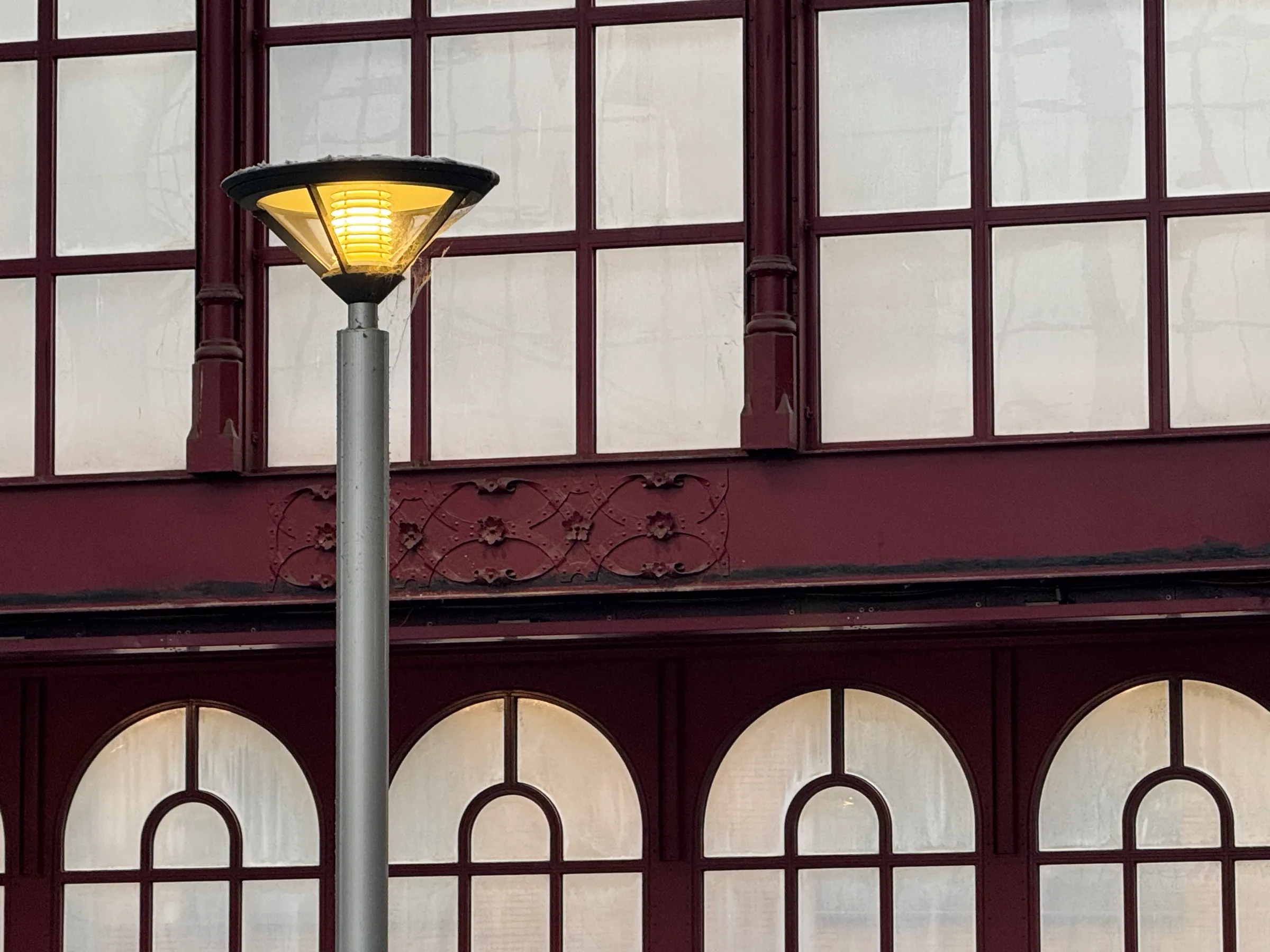
What stayed with me was the light. Under an iron roof finished in 1905, the newer platforms are lit by columns that glow like paper lanterns, and every one sits in a maroon frame that picks up the old ironwork above.

Two eras of building agreeing on two colours, without either one shouting. That’s what I wanted this theme to do: feel old and new at once.
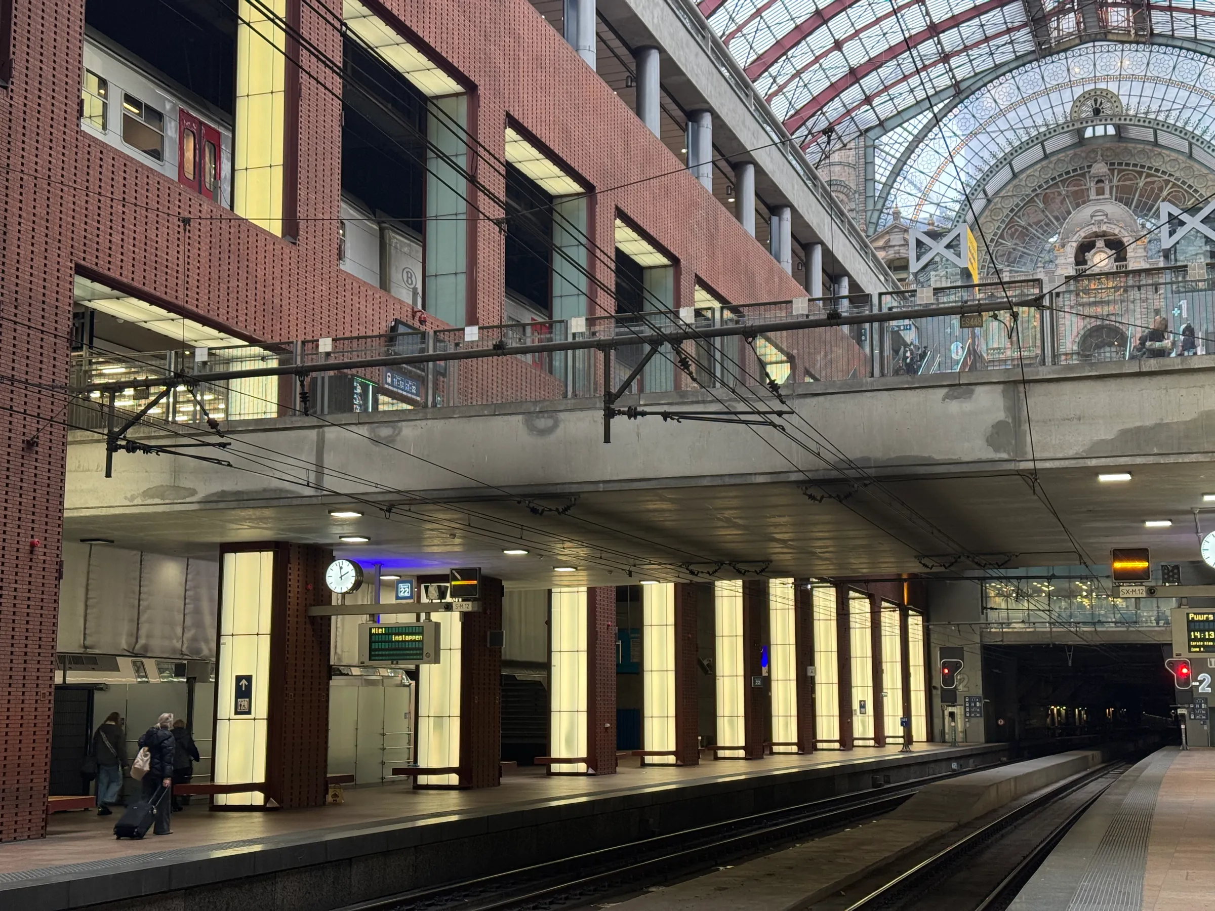
A platform at Antwerpen-Centraal: a row of cream light columns in maroon frames under a concrete deck, with the station hall’s glass and iron roof above.
  1. Maroon#562D35From the frame between two light boxes
  2. Cream#E7E0A9From the glass of a lit column
  3. Dark brown#2C1E1BFrom a column’s base, in shadow

The object

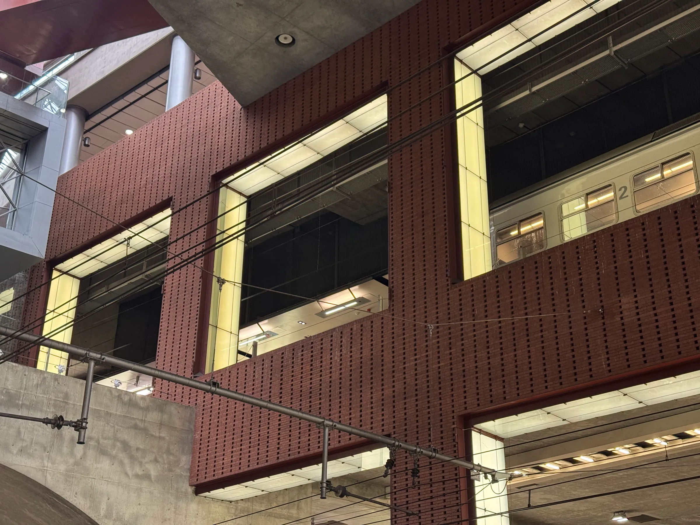
One of the lit columns on the platforms: glass panes in a frame, on a plinth. It’s the switch for this theme in the footer. Drag it to turn it, or focus it and use the arrow keys.
About the station

Antwerpen-Centraal was finished in 1905. Louis Delacenserie designed the stone building, and the engineer Clément Van Bogaert the iron and glass hall that arches over the old platforms. People call it the railway cathedral.

For a century it was a dead end: trains came in and went back out. Between 1998 and 2007 the station was dug out underneath, with new platforms stacked below the old hall and a tunnel carrying trains on under the city. The lit columns line those lower platforms, under the ironwork, which is where the maroon and the cream meet.

Photos and video taken by me.
San Francisco, United States

Golden Gate Bridge

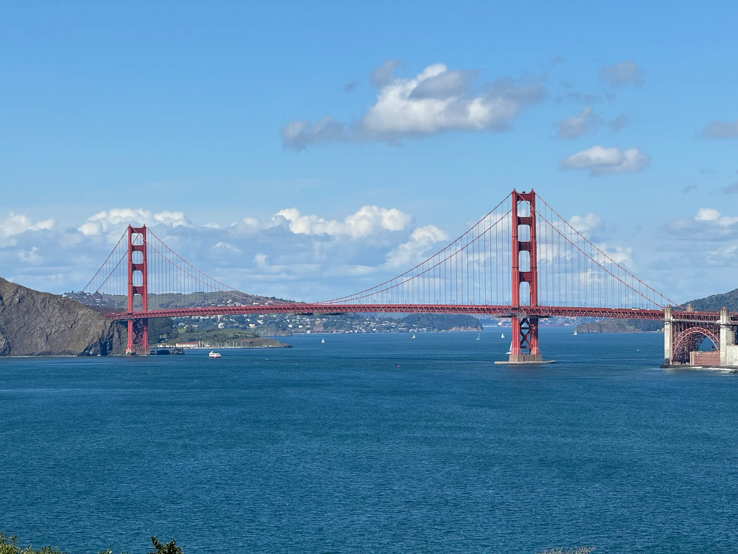
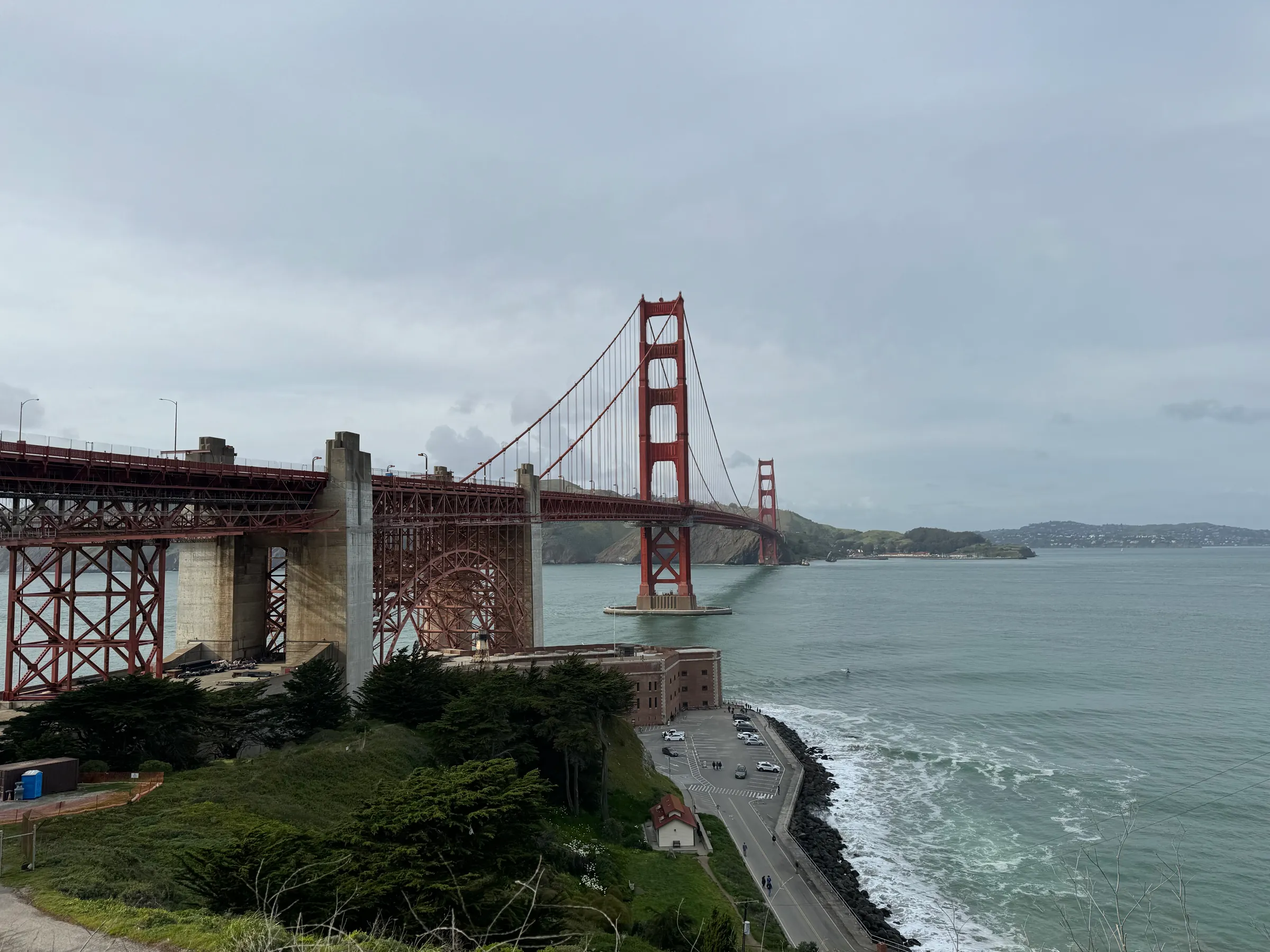
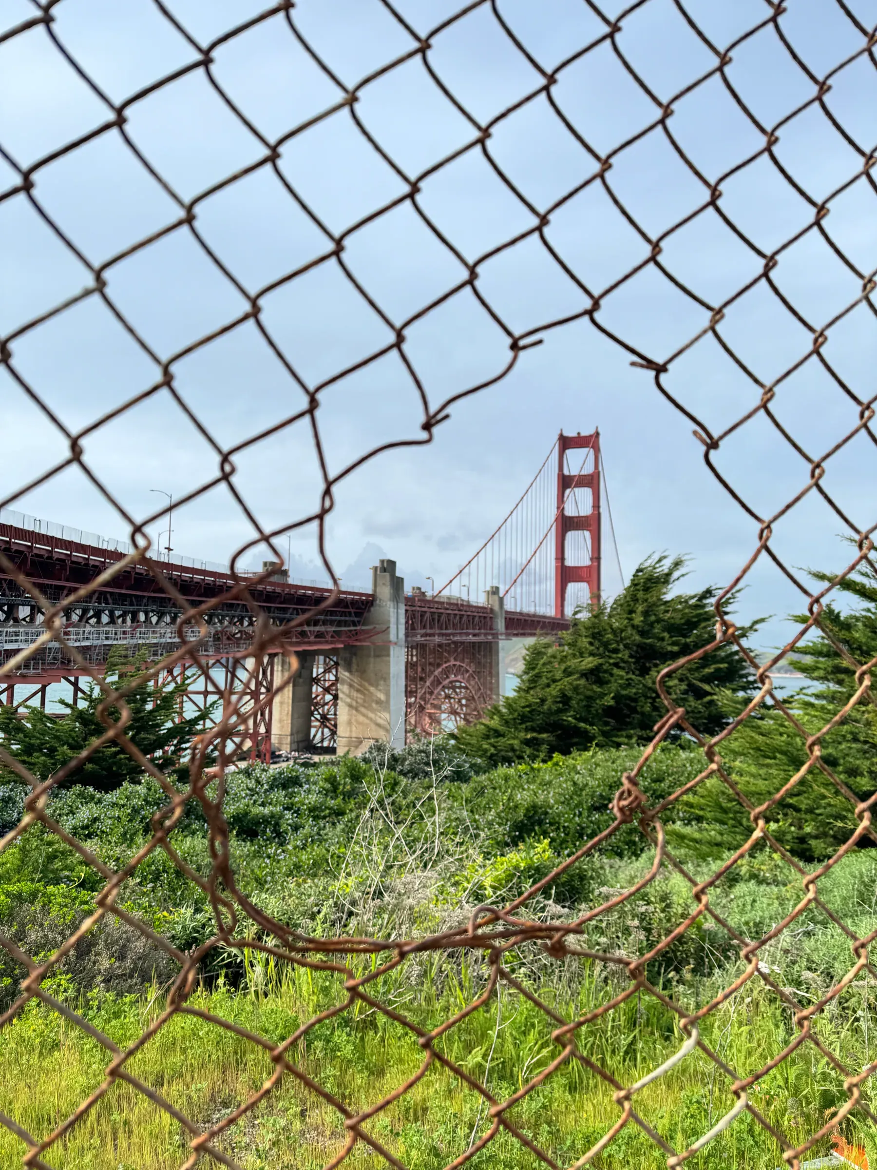
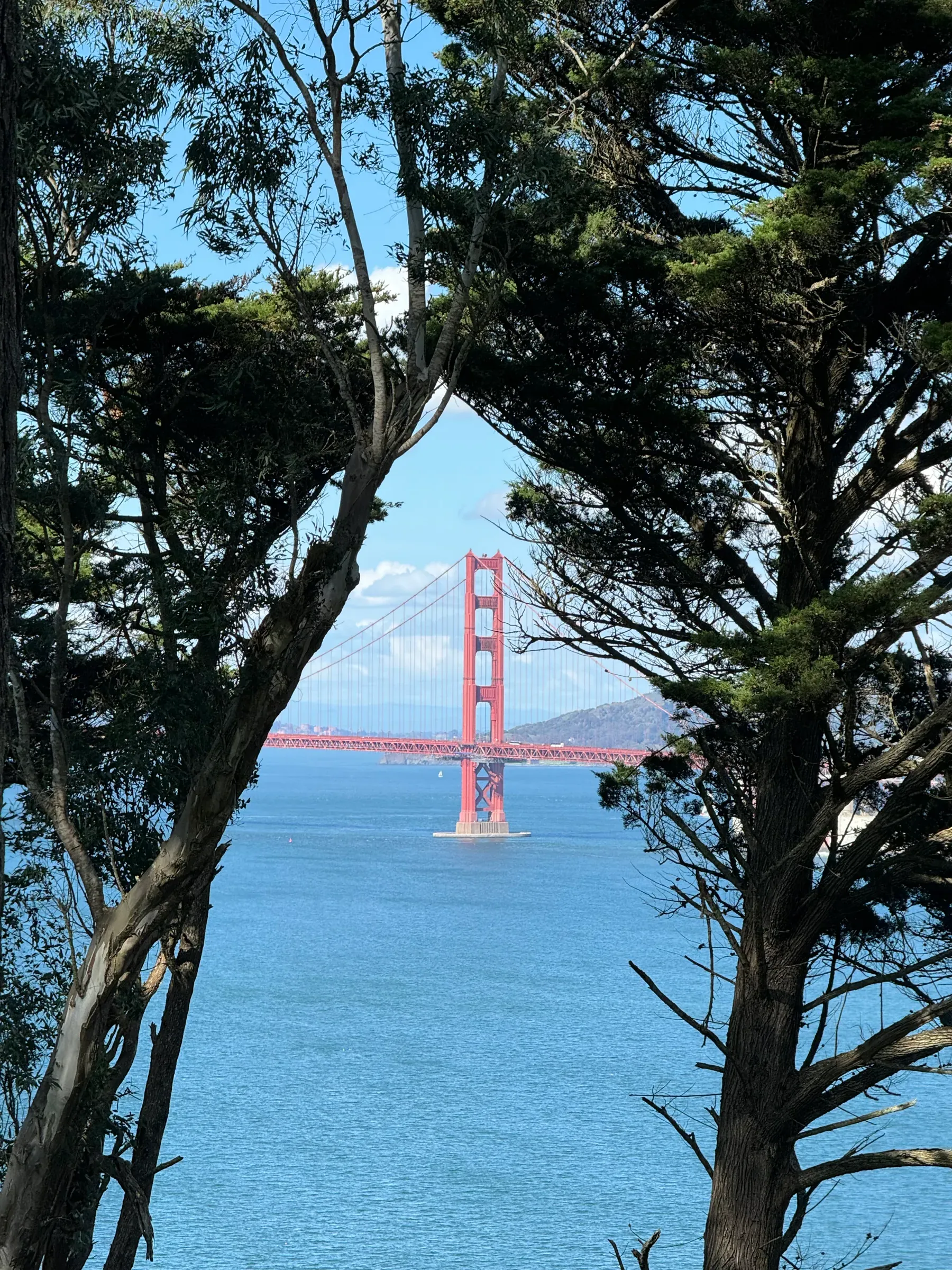
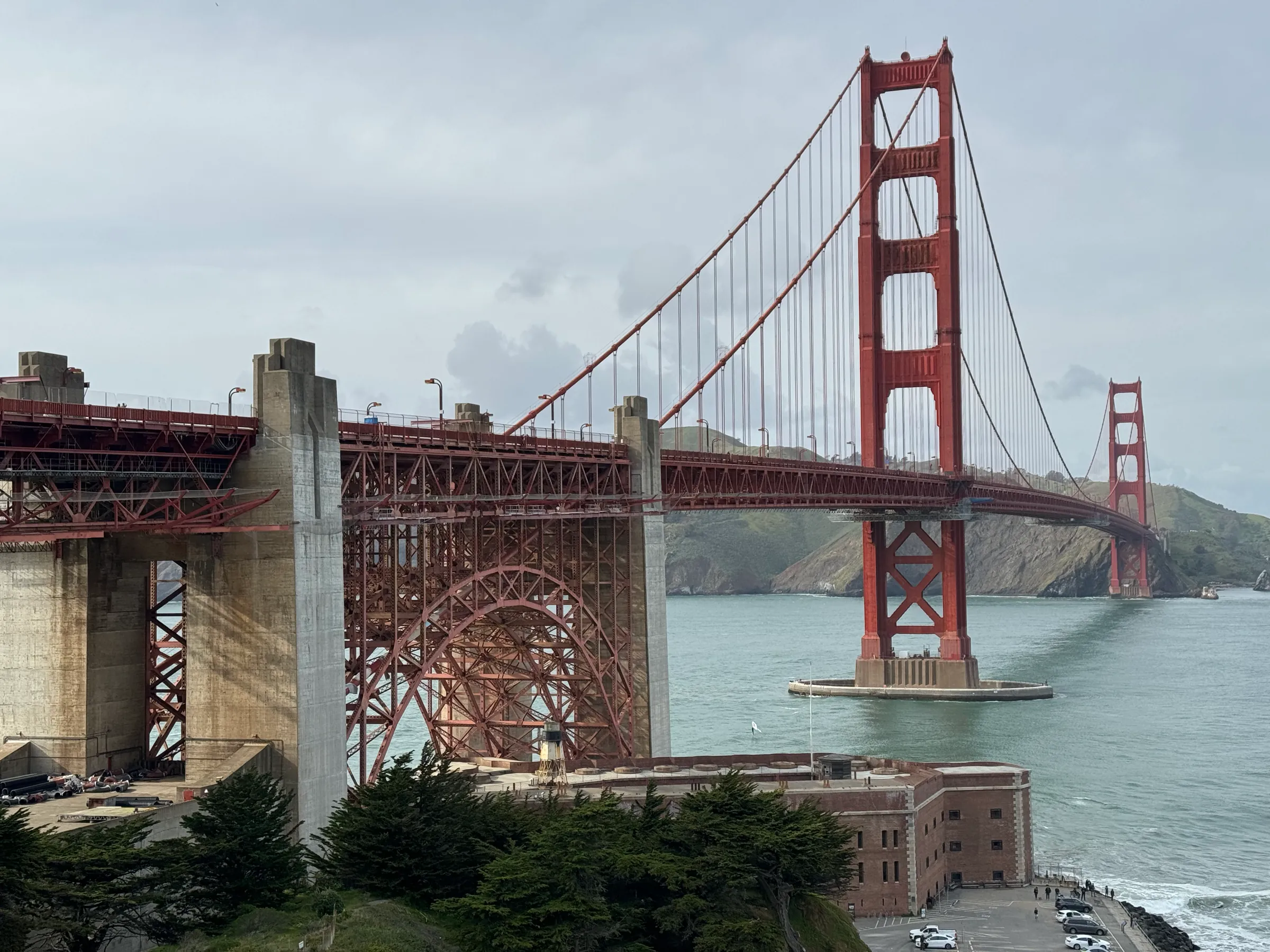
I kept photographing it through things: a rusted fence, a gap in the cypresses, from underneath the south end. The red never looked right on its own. It needed the grey of the concrete, the green of the scrub, the stone of the anchorage beside it.

So this theme isn’t only the famous orange. It’s the orange with what holds it up.

The Golden Gate Bridge’s south tower rising from its concrete pier in the water, beside the pale concrete anchorage and a red steel arch, under an overcast sky.
  1. International Orange#833839From the tower, in daylight
  2. Shadowed steel#6A3032From the tower’s leg, on its shaded side
  3. Sandstone#BBA482From the south anchorage, where the light hits it
  4. Pier grey#8B9998From the tower’s pier, at the waterline

The object

The south tower: twin legs that step in as they rise, four portal struts above the road and X-bracing below it, on a concrete pier. It’s the switch for this theme in the footer. Drag it to turn it, or focus it and use the arrow keys.

About the bridge

The bridge opened on 27 May 1937, the longest suspension span in the world at the time. Joseph Strauss was its chief engineer; much of the design work is now credited to Charles Ellis, with Leon Moisseiff’s suspension theory behind it.

The colour was an accident made permanent. The steel arrived painted in a reddish-orange primer, and Irving Morrow, the architect who shaped the Art Deco towers, argued to keep it: it sat well against the hills and stood out against the sea and sky. The Navy had wanted black and yellow stripes. The paint is still mixed to the same formula, International Orange.

Photos taken by me.